
Section 1: Overview
Hi there!
We’re so glad you are here. Meet Happi Pear®. Happi Pear® is all about offering you a different fruit experience with its unexpected bite. It is sweet in flavor, optimistic in nature and the fruit for every smile®.
Happi Pear® – The Story
Happi Pear® is the brand name for the HW624 pear cultivar. Its development began in 1988 at Vineland Research and Innovation Centre in Ontario, Canada. Using natural cross-pollination methods, researchers crossed Harrow Sweet and NY10353 pears in hopes of creating an attractive and delicious fruit that would be friendly to grow in top pear climates. It was selected for propagation in 1995, and HW624 was patented in 2017.
More than three decades after it was first developed, Stemilt Growers, a pear leader based in Washington State, adopted HW624 as a signature pear. The brand name Happi® was chosen to convey a positive emotion to help people feel optimistic. It’s a universal expression that represents luck, contentment, enthusiasm, and joy. The green-yellow color of the pear and the great eating experience it provides also fit well with the brand name, Happi®.
The pear is harvested in late August and two weeks after Bartlett pears. This is still considered early in the pear harvest season. Happi Pear® is among few branded pears available in the marketplace.
Brand Purpose
Happi Pear® exists to provide a different fruit experience and bring a smile to life’s simplest moments. It shakes up the pear world with an unexpected bite.
Brand Spelling & Pronunciation
The proper spelling for this brand is Happi Pear. It is purposefully spelled with an “i” instead of the more common “y.” This ties into the simplistic character of the brand.
Incorrect spellings include: Happy, Happie, Happey, Happee, Hapi and Pair, Pare, Pere, Paer.
It is pronounced ha · pee. The emphasis is on the first syllable “ha” and a soft “a” sound, followed by a quick “pee” that sounds like you would say the letter “p”.
The word Pear is pronounced pehr.
Here is an audio playback of the pronunciation of Happi:
Brand Promise
One of the defining characteristics of Happi Pear® is the fruit’s unique bite, especially in the current texture expectation people have for pears. Therefore, the brand promise for Happi Pear® is to deliver unexpected bites of cheer.
Brand Tagline
The tagline to use alongside the Happi Pear® brand is:
The Fruit for Every Smile™.
It reinforces the brand name and the brand purpose by restating that this is the fruit that will bring a smile to life’s simplest moments.
Brand Domain Name
Happipear.com
Legal Statements & Use
Happi Pear® is a trademark owned by Agriculture and Agri-Food Canada. To maintain the trademark, the following statement should be used in conjunction with Happi Pear® whenever possible:
Happi Pear® is a trademark of Agriculture and Agri-Food Canada, registered for use in connection with fresh pears of the AAC ‘HW624’ cultivar and is used under license.
This statement can be used in small print on printed materials, similar to how you would include a footnote on a document. It is required on packaging. Please refer to packaging guidelines for placement and proper use.

Section 2: Messaging
Audience
Pear fans are found in every age group and demographic. But Happi Pear® is not your average pear, or fruit for that matter. It’s the fruit for every smile™ and has an unexpected, cheery bite that was made for this key audience: curious fruit enthusiasts that are striving for a balanced life.
How do we appeal to curious fruit enthusiasts? Happi Pear® does it through its personality and by bringing happiness to life’s simple moments
Persona + Tone & Voice
If Happi Pear® were a person, they would be all about spreading joy. Genuine, always assuming the best of others, wholesome, fun, relatable and casual are words that describe Happi Pear®. If you think about a movie character that Happi Pear™ resembles, it would be Forrest Gump or Dory from Finding Nemo. Happi Pear® wants to make people feel accepted, excited and above all, happy. Happi Pear® does this through an energetic, caring, and uplifting way with no ulterior motive.
Happi Pear® promises to keep messages to its audience simple and optimistic. They strive to be happy, are motivated by fulfillment, and fear disappointing people and making them unhappy. They aim to do things right. Happi Pear®’s gift to others is optimism, wholesomeness and a big heart.
Happi Pear® is:
- Cheery
- Authentic
- Wholesome
- Inviting
- Accepting
- Energetic
We Are Not:
- Immature
- Mean
- Obnoxious
- Goofy
- Straight Edged
- Annoying
Tone of Voice Rules:
- Happi Pear® conveys cheer without being overly excited
- Is direct, yet inviting
- Is NOT about itself, but about others
- Always happy
Happi Pear® Key Messages
There are 5 key messages to use when describing Happi Pear® to consumers:
- Sweet with a bright & zesty bite
- Delightfully pure
- Enjoy when yellow or green
- Simple & refreshing
- Great for grazing
If room allows, consider these secondary messages for consumers:
- Grown for life’s simple moments
- Wholesome, sweet flavor
- Exists to bring a smile to life’s simple moments
- Keep it fresh by consuming straight out of hand or part of grazing table line up
- Created through natural cross-pollination. Non GMO
Happi Pear® Tone of Voice: Do’s and Don’ts
Here are examples of “DO’S” when it comes to speaking as Happi Pear®
to consumers:
- Find happiness even in life’s simplest moments. | DO: Be optimistic
- Tell us three things you’re grateful for today! | DO: Talk about others first
- Hey #HappiHelpers, you got this! | DO: Convey cheer
- How are you spreading happiness today? | DO: Promote happiness
- This wholesome duo is the definition of happy! Tag your other half and tell us why they make you happy! | DO: Be inviting and engaging
- Sometimes simple just tastes better. | DO: Be simple and direct
Here are examples of “DON’TS” when it comes to speaking as Happi Pear®:
- Make your day better with Happi Pear®. With a bright, zesty bite, Happi is sure to bring a smile to your face | DON’T: Be boastful and self-seeking
- I’m a cross between the Harrow Sweet and NY10353 pears. I’m sweet and zesty and turn bright yellow when I’m ready to eat! | DON’T: Be about yourself
- Don’t worry #HappiHelpers, it’s a good day to have a good day! | DON’T: Be too flowery and annoying
 Approved Hashtags:
#happipear
#happihelper
#behappi
#thefruitforeverysmile
Legal Statements & Use
Happi Pear® is a trademark owned by Agriculture and Agri-Food Canada. To maintain the trademark, the following statement should be used in conjunction with Happi Pear® whenever possible:
Happi Pear® is a trademark of Agriculture and Agri-Food Canada, registered for use in connection with fresh pears of the AAC ‘HW624’ cultivar and is used under license.
This statement can be used in small print on printed materials, similar to how you would include a footnote on a document. It is required on packaging. Please refer to packaging guidelines for placement and proper use.
Section 3: Logos & Taglines
3A: Primary Logo
The primary logo for Happi Pear® is a word mark and icon. The main lettering is simple and happy that helps emphasize the personality values of the brand. The bold letters stand firm for ease of legibility. The balloon icon is a key feature for making the brand recognizable and memorable.
This is the main logo that will be used across primary brand applications. This trademark helps audiences easily identify Happi Pear® at stores, packaging, web presence, ads, and other materials that enhance the playfulness of the brand. It is essential to the success of the brand that the logo always be applied with care and respect in every applications according to the guidelines .
Do:
Use what’s provided, that’s pretty simple.
Don’t:
Examples of what not to do.
Please Handle Logo With Care
- Don’t feed the logo – Keep the original scale and font size relationship
- Do not stretch, trim or smash the logo
- Do not get sideways with logo – Keep the logo on the horizontal axis without tilting or rotating
- Do not play dress up with the logo – Keep to the designated print colors
![]()
![]()
3B: Primary logo with tagline
Big & tall or short & small here is how to deploy Happi in different uses.
Do:
Use the logo in a few different ways depending the dimension & use.
A.
Primary logo with primary tagline placement
B.
Primary Logo with tagline is available in a horizontal layout (secondary tagline placement)
Don’t:
Examples of what not to do.
Please handle taglines with care
- Do not stack tagline above brand logo
- Do not stretch, trim or smash the tagline
- Do not get sideways with tagline – Keep the tagline on the horizontal axis without tilting or rotating
- Do not play dress up with the tagline – Keep to the designated print colors
![]()
![]()
3C: Variable logos & taglines
Happi Pear® secondary logos can be used in replacement of primary logo when not on a purple background. The taglines can be used with or without the primary logo but should be used carefully as shown in these example placements.
Logo
A) Purple Happi Pear® logo
B) Encapsulated (rectangle) Happi Pear® logo
Tagline Below
C) Purple Happi Pear® logo tagline below
D) Encapsulated (rectangle) Happi Pear® logo with tagline below
Horizontal Tagline
E) Purple Happi Pear® logo with horizontal
tagline
F) Encapsulated (rectangle) Happi Pear® logo with Horizontal tagline placement
3D: Exception logo use
When colors are not available, please revert to a solid black logo when applying the Happi Pear® logo. Please seek approval of this use.
Black
 Pantone: PMS Black 6
CMYK: C:0 M:0 Y:0 K:100
RGB: R:0 G:0 B:0
Web Safe Hex: #000000
Example
Legal Statements & Use
Happi Pear® is a trademark owned by Agriculture and Agri-Food Canada. To maintain the trademark, the following statement should be used in conjunction with Happi Pear® whenever possible:
Happi Pear® is a trademark of Agriculture and Agri-Food Canada, registered for use in connection with fresh pears of the AAC ‘HW624’ cultivar and is used under license.
This statement can be used in small print on printed materials, similar to how you would include a footnote on a document. It is required on packaging. Please refer to packaging guidelines for placement and proper use.
Section 4: Guidelines

4A: Brand Color Usage
Packaging
There are two options for color palette when creating packaging for the Happi Pear® line of products
 Pantone: PMS 266c
 Pantone: PMS White
4B: Certification Logos & Statements
Pouch Bag Example
Certification logos and statements can be placed in designated locations on the pouch bag A, B, C, D.
These logos or statements are to be a one color, white.
Please submit any additional certification logos
or statements to Stemilt for approval.

4C: Color Usage
Design
When designing ads, promotional materials, and digital materials for Happi Pear®, there are 3 options in the color palette. Green is added as an accent or secondary color.
3 color palette
Green can only be an accent color.
Primary logo or tagline can never be green.
 Pantone: PMS 382c
Example

Example

4D: Logo Spacing
Logo Spacing
It’s important that the Happi Pear® logo always has clear space to ensure legibility and that means there must be a minimum clear space around the logo.
The minimum clear space is defined as the width of the “H” (from the primary logo). This minimum space should be maintained as the logo is proportionately resized.


4E: Logo Spacing
Logo Spacing with Tagline
Clear space to ensure legibility, always keep a minimum clear space around logo when tagline is being used. This space isolates the mark of any competing graphic elements like other logos or body copy that might conflict with, overcrowd, and lessen the impact of the Happi Pear logo and tagline.
The minimum clear space is defined as the width of the “H” (form the primary logo). This minimum space should be maintained as the logo is proportionately resized.
Tagline height (right of the logo)
When using the tagline to the right of the logo please do not exceed half the height of the letter “H” when scaling


4F: Typography
Typography is a powerful brand tool when used consistently. This set of typefaces best represents the joy and happiness of the Happi Pear® brand and should be used across all print & web applications.
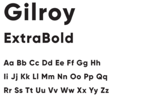
Gilroy
Use for headlines.
Sentence Case
Tracking for each character: +50
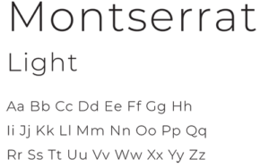
Montserrat
Use for body copy.
Sentence Case
Tracking for each character: +50
Alternate Display Fonts
Only to be used in situations of presentations when brand fonts cannot be available. (PPT, Word, ect.)
Verdana Bold (in place of Gilroy ExtraBold)
Microsoft Sans/Geneva (in place of Montserrat Light)

4G: Photography
What to do
When photographing Happi Pear®, utilize the purple brand color as your background. Whenever purple is used, the white primary
logo can be used.
When you are using a orchard shot or a busy background photo please use the secondary rectangle logo. This will allow the Happi Pear®
brand to stand firm.
What not to do
Don’t us logo on photography without the purple background.


4H: Activities
Happi Pear® on Logowear
The primary Happi Pear® logo on a purple garment is the preferred use for logowear. Taglines can be used with or without the primary logo but should be used carefully.
Other Acceptable Uses on Logowear
A) White Happi Pear® logo on a purple background (with or without tagline below logo)
B) Purple Happi Pear® logo on white or a neutral gray garment, with or without tagline below logo
C) Happi Pear® logo alone may be present on the front with tagline placed on the back of garment or sleeve
4I: Iconography
Brand Assets
The Happi Pear® icons can also be paired with secondary assets to further the brand experience across other platforms.
Happi Pear® Experience Icons
These 3 icons can be used throughout the Happi Pear® design to inform the consumer about this unique pear.
Flavor Balloons
The “Flavor Balloon” should be placed only in the top right hand corner. Please refer back to the spacing guidelines to ensure this icon will not intrude on any logos or taglines.
Floating Balloons
Outside of the primary logo, the floating balloon should only be used on packaging in a set of 3. Please see the carton and pouch bag.
The Happi Pear®
The Happi Pear® is a photograph of the fruit with a smile. This image should be the primary image within your design if used.
QR Code
Please use QR code with the learn about statement in a non primary location. Example: corners or sides of layout.
Legal Statements & Use
Happi Pear® is a trademark owned by Agriculture and Agri-Food Canada. To maintain the trademark, the following statement should be used in conjunction with Happi Pear® whenever possible:
Happi Pear® is a trademark of Agriculture and Agri-Food Canada, registered for use in connection with fresh pears of the AAC ‘HW624’ cultivar and is used under license.
This statement can be used in small print on printed materials, similar to how you would include a footnote on a document. It is required on packaging. Please refer to packaging guidelines for placement and proper use.
Happi Pear® Logos
Full Set
Logos can be downloaded by clicking the button below:
Happi Pear® Font Family
Full Set
Fonts described in the font explanation section above, can be downloaded by clicking the button below: